
You have to admit, even though Starbucks is a multi-billion dollar company who sell shitty coffee at an obscene mark-up, they do have a pretty cool logo. By which we mean, if you squint hard enough, you can see a pair of boobs.
To explain, the original Starbucks logo the company used when it first launched back in 1971, featured a more, shall we say, risqué shot of the now iconic Starbucks Siren in which her breasts were clearly visible, proof that even back then, people would buy shit if you stuck a picture of a naked woman on it.
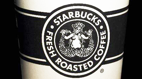
Over the years this logo changed to focus more on the siren’s face with her previously uncovered and offensively perky breasts either left out of shot completely, or covered elegantly with her hair. Because apparently putting a sopping wet naked fish monster on the front of your product is okay if only you know that she’s naked.
Today, the fact that the Starbucks siren is naked or a weird-ass fish monster is almost impossible to notice because the logo is so stylised there’s almost no hint that the siren is supposed to be stood there with her wing wams flopped out. We know this because when Starbucks tried to bring back the old-school logo in 2008 as part of a campaign to celebrate getting away with ripping people off for nearly 40 years, a group of asshole Christian pressure group complained because you could see the siren’s breasts. You know, even though the siren has been naked on every cup ever sold since the 70’s.
Which must have come as quite a shock to Starbucks executives who’d already anticipated this exact reaction and explicitly requested that the “vintage” logo was redesigned to make it less salacious than the one the company used originally. Something the company’s graphic designers accomplished by removing the siren’s nipples and making her slightly thinner, rather than making the logo any less controversial this redesign actually just ensured that it offended both far right Christian groups and people who liked their sirens with a little junk in the trunk. It probably says a lot that Starbucks couldn’t even bring themselves to use their own logo during a campaign all about celebrating their history but then again it also says a lot about the public that after being charged 4 dollars for a cup of coffee, the main complaint of a small, but oddly vocal minority was that there was a cool picture of a naked fish woman on it.
As you’d expect from a company who give so few shits about their customers they never even bother to learn to spell their names properly, Starbucks told this group to kindly go fuck themselves because they still had like 40,000 more cups with a naked mermaid on to use up and continued with the campaign. Ah, business.

")


